Guiding the customer along the right path: that was our task in this project. A task that we mastered thanks to our expertise in behavioral design. We developed different variants of a switch page and compared its effectiveness in a quantitative online experiment. Which variant promotes the target behavior most effectively? Find out for yourself.
Customers can apply for the Cumulus credit card in different ways: in the Viseca oneApp, in the browser (mobile / desktop) or on paper. If they apply directly in the oneApp, they receive a credit card that can be used immediately within 10 minutes. This is thanks to the fully automated self-onboarding process, which allows the issuer Viseca to process orders efficiently. The aim of the project was therefore to direct as many customers as possible to the app application. This is the most efficient method of credit card creation for both, the customer and the issuer. The aim was to ensure that as many customers as possible choose this route by means of a switch page at the start of the application. The Ergonomen were involved in order to maximize its effectiveness.
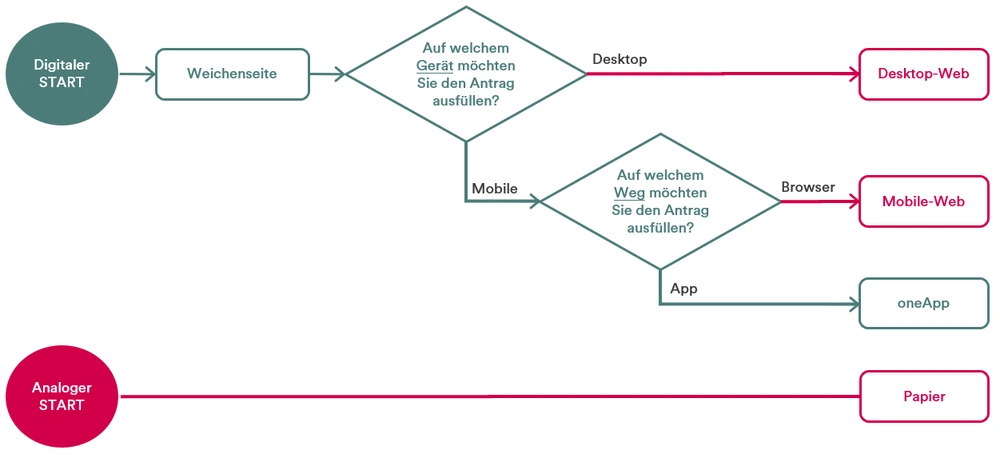
Fig. 1: User Flow Diagram. The green path is the fastest way to apply for the Cumulus credit card.
In the first step, we used the BCX canvas to sharpen the target behavior together with Viseca in a workshop and to identify the factors that inhibit and promote it from the customer's point of view. How can we support the applicant in demonstrating the target behavior? How can we strengthen the perceived benefits or reduce the perceived costs? Essential questions when it comes to developing behavioral economic interventions. This workshop laid the foundation for all further work.
Info: The canvas can be purchased here as part of our BCX starter kit.
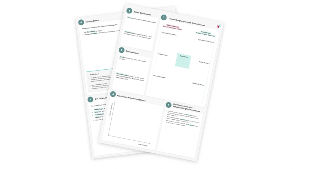
Fig. 2: The BCX canvas we developed has once again proven its worth.
In a second step, we developed various versions of the switch page in a creative concept sprint. To do this, we specifically used behavioral economic approaches that have a proven influence on the decision-making behavior of users. More on this later. In Figma, we finalized the treatments for three prototypical switches per device (mobile / desktop). As the product was not yet on the market at the time of testing, we used the pseudonym "Zuppi App" for "oneApp".
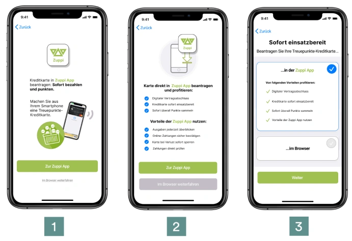
Fig. 3: Which variant increases the number of app applications most effectively?
In the next step, we set up a quantitative behavioral economics experiment to find out which variant of the switch page is most effective in nudging users towards the app application and at the same time leads to as few abandonments as possible. Recruitment was carried out via our in-house pool (N ≈ 2,000). Almost 400 potential credit card customers took part in this experiment. The test subjects were shown one of three options and then asked what they would do next (intention). We then analyzed the results statistically.
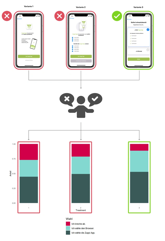
Fig. 4: Procedure of the behavioral economics experiment.
The results showed which design can be used to promote the target behavior: Variant 3 led to significantly fewer abandonments and an increased number of app completions. The recipe for success of this design included giving the customer the freedom to choose the application (choice architecture) instead of nudging them too strongly into one variant, as the latter encourages reactance. Despite the freedom of choice, the customer also appreciates a pre-selected option (default option) as it speeds up the selection process. In addition, the advantages of the application route should be communicated transparently to the customer (benefit communication). The winner in these disciplines prevailed in the experiment. Variant 3 was therefore handed over to our partner BlueGlass for implementation in the user interface design.
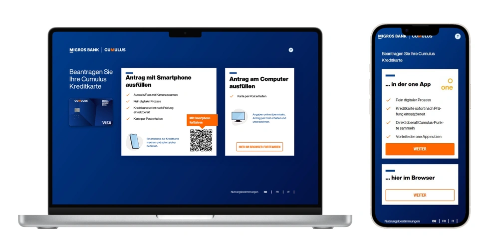
Fig. 5: The experiment winners desktop and mobile in the final UI design.
With this project, we were able to show how we can shape customer behavior using behavioral design. For Viseca, we developed a switch page that is easy for the customer to understand and optimally fulfills the business objectives. A win-win situation for users and the company!
The success of the entire "Cumulus Credit Card" project was recognized with a Best of Swiss Web Award in the "Digital Commerce" and "Technology" categories. Many thanks to our submission partners Viseca and BlueGlass and, of course, to the Federation of Migros Cooperatives and Migros Bank for this exciting project.
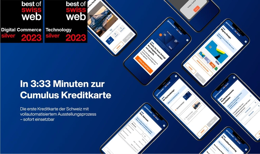
Fig. 6: Two silver awards for the Cumulus application at BoSW 2023.
Ergonomen Usability AG supported us in the development of the digital application process for the new Cumulus credit card. In this complex project with three organizations involved, Ergonomen ensured that the user perspective was systematically represented and that an overarching, consistent user experience was guaranteed across all customer touchpoints. The services provided by the Ergonomen in this mega project ranged from conception and evaluation to the implementation of targeted measures. The Ergonomen absolutely lived up to their promise to make the complicated simple. Many thanks for the collaborative partnership. World class!